Friday, December 30, 2016

Google+ ripples: A native visualization of information flow

Note

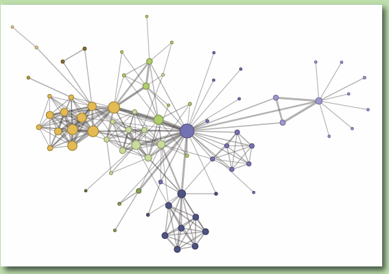
A nested circles style to present the temporal pattern of re-sharing. The sharing action is structure as tree-map. The nested circle helps to highlight the cluster in each branch. This paper discusses the design factors included: social media sharing pattern, rendering, interaction and animation. I think it would be a useful way to tell the story about the temporal, social network trends. The display is bright for the user to understand the whole picture of the certain topic or post to spread.


An extend reading of the nested circle of [2]. The paper models the exploratory search tasks as a radar plot. The user can drag the interested item into the plot to filter the result. In [1], the figure helps to show the social media sharing pattern as circles, however, in [2], from a different perspective, to help the user to filter the result. The two scenario may mutually relevant.

Reference
  1. Viégas, Fernanda, et al. "Google+ ripples: A native visualization of information flow." Proceedings of the 22nd international conference on World Wide Web. ACM, 2013.
  2. Kangasrääsiö, Antti, et al. "Interactive Modeling of Concept Drift and Errors in Relevance Feedback." arXiv preprint arXiv:1603.02609 (2016).


Thursday, December 29, 2016

The structure of the information visualization design space

Note:

This paper provided a framework to organize and structure the visualization plots. It considers the following features:

  1. Data Type: Nominal, Ordinal, Quantitative, Intrinsically Spatial, Geographical, Set mapped to itself
  2. Function for recording data: filter,sorting,multidimensional scaling,interactive input ot a function
  3. Recorded Data Type: same as Data Type
  4. Control Processing : tx (text)
  5. Mark Type: point,line,surface,area,size
  6. Retinal properties: color, size, connection, enclosure
  7. Position in space time: position in space time, N (Nominal) O (Ordered) Q (Quantitative)
  8. View transformation: ::=nb (hyperbolic mapping)
  9. Widget: slider, radio buttons


For example: Multi-Dimensional Tables


Points: 1) many of the visualization is not web-based. Is there any particular reason to use web standard? 2) if the web-based visualization, what is the framework different? e.g. the web-based application may using more mouse gesture to click, scale and hover. Or, with help of useful libraries like D3.js, how does it influences the implementation of data visualization? 3) the design space for non-web-based applications are more open and less limitation, but accessibility is weak to share and collaborative.

Worth to read more: [2], [3], [4] for the web-based space of data visualization.

Reference:
  1. Card, Stuart K., and Jock Mackinlay. "The structure of the information visualization design space." Information Visualization, 1997. Proceedings., IEEE Symposium on. IEEE, 1997.
  2. Figueiras, Ana. "A Typology for Data Visualization on the Web." IV 13 (2013): 351-358.
  3. Turetken, Ozgur, and Ramesh Sharda. "Visualization of web spaces: state of the art and future directions." ACM SIGMIS Database 38.3 (2007): 51-81.
  4. Brath, Richard, and Ebad Banissi. "Using Typography to Expand the Design Space of Data Visualization." She Ji: The Journal of Design, Economics, and Innovation 2.1 (2016): 59-87.

A Tour through the Visualization Zoo

Note

This paper introduced the basic figure plots for data visualization. The mentioned schemes included:
  • Time Series Data: Index Chart


  • Time Series Data: Stacked Graph


  • Time Series Data: Small Multiples


  • Statistical Distribution: Horizon Graph


  • Statistical Distribution: Stem-and-Leaf Plot


  • Statistical Distribution: Q-Q Plots
  • Statistical Distribution: Scatter Plot

  • Statistical Distribution: Parallel Coordinates

  • Maps: Flow Map


  • Maps: Choropleth Map

  • Hierarchies: Node-Link


  • Adjacency Diagrams: Lcicle Tree Layout

  • Adjacency Diagrams:Enclosure Diagrams


  • Network: Treemap


  • Network: Nested Circles

  • Network: Force-directed Layout


  • Arc Diagram


  • Matrix View


Reference
  1. Jeffrey, Heer, Bostock Michael, and Ogievetsky VADIM. "A Tour through the Visualization Zoo." Communications of the ACM 53.6 (2010): 56-67.

High-dimensional data visualization

Note:

This paper introduced the basic figure plots to display the multi-dimensional data. The mentioned schemes included:

  • Mosaic Plots
This plot is good for categorical data display, for the user to compare the different between features. But it requires the user to pay attention to multiple directions (top/bottom, left/right), which makes it harder to follow, less user perception. Besides, this plot provides a quick overview categorically, but for ordinal and interval variables.

  • Trellis Displays

Nice to provide a comparison between variables, not suitable for temporal data and categorical data. Besides, many of the cells may repeating or empty.

  • Parallel Coordinate Plots

Nice to show the temporal data, requires the skill to solve the overplotting, scaling and sorting problems.

  • Projection Pursuit and the Grand Tour


Not easy for the human brand to process a 3D plot, but it shows the dynamic between the dimension projection. For instance, using a scatterplot with 3 dimensions, let the user explore the pattern across dimensions, is one type of grand tour.


Summary


A summary with the functionality of exploration and presentation included the interactivity of each plot. However, I think the Trellis may also provide interactively, e.g. this demo


Reference
  1. Theus, Martin. "High-dimensional data visualization." Handbook of data visualization. Springer Berlin Heidelberg, 2008. 151-178.

Wednesday, December 28, 2016

Collaborative visual analysis with RCloud

Note

This paper discussed a collaborative visual analysis environment for a team work. For a data science related project work, it is very common to design, analyze and deliver the result to target audience, could be a colleague, customer or your boss. This is a process of exploratory data analysis (EDA). This paper argues the works are usually done by different tools, i.e. coding in scripting language and design the interface with web techniques. This makes the collaborative work very difficult, due to lack of discoverability (code reuse), technology transfer (collaborate) and coexistence (plus interactive visualization tool). Hence, this paper proposed a framework - RCloud, which using R to integrate the back end analyze and front display in a restful API structure. The basic idea is every application natively demonstrates the result to users through web browsers. This framework is re-using and coupling the existing package in R.

Points: in a small scale teamwork size and low dynamic of project requirements, I think this framework would work well. However, if more and more projects (usually small and not mature result) go live, the search and re-use may create extra workload for the developer. In another hand, the R package may not be suitable to solve all the practical problems, e.g. a large scale data storage or distributed computing tasks. Besides, there are more framework options to better facilitate the collaborative between developer and designer, e.g. the MVC framework. I think a good framework should stand alone with the specific language and techniques, so it can generally support to dynamic real world requirement.

I actually like this idea, it shows the values to deliver the beta works to the users. It 'd be good if we can put the research finding or preliminary result on the web for a better potential collaborative, public exposure, and self-advertisement. The other trend is using Scala to bundle the analysis, implementation, and production.

Reference
  1. North, Stephen, et al. "Collaborative visual analysis with RCloud." Visual Analytics Science and Technology (VAST), 2015 IEEE Conference on. IEEE, 2015.

EgoNetCloud: Event-based egocentric dynamic network visualization

Note

A quality work on network visualization, this paper proposed a visual analytic tool to display the structure and temporal dynamics of an egocentric dynamic network [1,3].  It considered three important design factors in this work: 1) network simplification: to show all the links in the network graph is meaningless and over the information loading for users. A reasonable way to "prune" the node to highlight the important nodes is necessary. It firstly defined the weighting function by co-author number and ordering. Based on the weighting function, the authors tried four different approaches to pruning the node, to maximize the efficiency function, which maxes the weighting in the sub-graph.
2) temporal network: the temporal information present by horizon graph with an axis of time. It would be a simple task to identify the distribution over time; 3) graph layout: the layout designs with a 2D space. Due to the temporal relationship, the chart divides into several sub-graph that hard to fit by regular force-directed graph layout. They extend the stress model to calculate the ideal design [2].

Points: 1) the research methodology of visual analytic: from design, implantation, case study to user study. The user study design is a useful reference for my research; 2) considering the single publication as an event to form the egocentric network. It may supports to multiple use cases, e.g. urban computing, conference, news event, etc. This system is suitable to explore the relationship of a given dataset, for a temporal and egocentric related tasks; 3) the interaction of slider on time and weighting items is useful for a user to explore the content. It may potentially help a user to understand the deep relationship of the given person. This idea may also link to the explain function in the recommender system.

A worth to read citation [4].

Reference
  1. Liu, Qingsong, et al. "EgoNetCloud: Event-based egocentric dynamic network visualization." Visual Analytics Science and Technology (VAST), 2015 IEEE Conference on. IEEE, 2015.
  2. Gansner, Emden R., Yehuda Koren, and Stephen North. "Graph drawing by stress majorization." International Symposium on Graph Drawing. Springer Berlin Heidelberg, 2004.
  3. Shi, Lei, et al. "1.5 d egocentric dynamic network visualization." IEEE transactions on visualization and computer graphics 21.5 (2015): 624-637.
  4. Zheng, Yixian, et al. "Visual Analytics in Urban Computing: An Overview." IEEE Transactions on Big Data 2.3 (2016): 276-296.

Tuesday, December 27, 2016

Following scholars


Network Science
Recommendation System
Visualization